Film
titles are used in TV and film to present their productions and introduces
important members of the creation of the programme or film, such as: cast
members, directors, producers, artists etc.
We
can split film credits into two, there is the ‘Title sequence’ and there is the
‘Opening credits’. Opening credits are nothing but a series of text introducing
important members of the production. The title sequence is similar however
normally presented with use of visual and sound editing.
The
film opening can consist of many credits, such as: Production Company, studio, producer,
director, actors, title, music, designers, editors, book influence, and writers.
Not
only is the credits just a list of names, it can also hint the genre through its
typography, for example, quite sharp and brittle lettering can connote it is a
serious film maybe a thriller or horror full of danger. Also with the use of
background action it can also show us characters and what they may be like and
set the scene by adding location. The editing side of the
credits can influence what film may be like and intrigue the audience more to
watch further into it, for example a plain slide of text may give expressions that
the film is quite dull and not well thought out.
 In ‘True
Detective’, the title sequence is full of superimposed images, fading in and
out, the use of these images hints the setting, actors and maybe what the
programme is about. The credits seem to go in order of importance in the
involvement of the production, from actors in the beginning, to production
teams throughout and towards the end, the creators – writers, creators and directors
in their own section of the title sequence; it is clearly separated by the main
title appearing before the creators. Non diegetic sound is also used, it is quite
mournful music, expressing that the programme is full of despair and
unhappiness which relates to it's thriller genre. The typography is seen as formal with no use of bright colours,
just grey, could hint that the film is about serious situations that could
relate to reality.
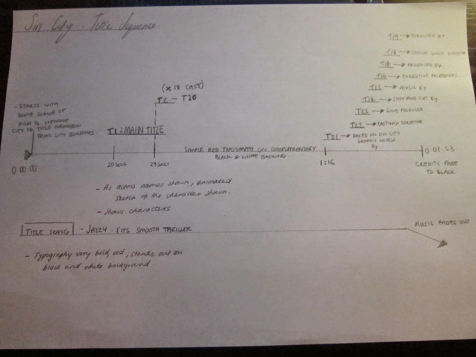
In ‘Sin City’, the title sequence starts with a small section of the narrative, showing a man holding a dead woman, it slowly edits to a panorama of the city itself – establishing setting and creatively using the city buildings to create the main title. The editing of the spilling red pigment onto the title is used to create the final red title and can maybe signify 'blood' pouring and so portraying the film as a quite blood filled thriller film. Cast credits are shown, accompanied with static comic images of the characters (in relation to its original graphic novel), this shows us who plays who. The typography used is very bold, large and very comic like and stands out well with its red colour on a black and white canvas,and therefore relating to its hybrid genre of a thriller/noir film. The red may connote certain aspects that may be found in the film such as blood and violence. The title sequence also has non diegetic music; jazz music, this helps us visualize a detective type of movie, smooth yet violent, overall gives a sense of enigma, which is typical for a thriller genre. Also the dark editing, which is typically used in a thriller genre gives a sense of hopelessness. The setting of a city, can be manipulated to project unsafety as we see the city as a very large place.


No comments:
Post a Comment